Look, I’ll be honest—when I first started using Lightroom presets, I thought they were kind of cheating. Like, shouldn’t I be adjusting every slider manually to really understand what I’m doing? But after editing hundreds of photos for Instagram and realizing I was spending more time editing than actually creating content, I changed my perspective pretty quickly. Presets aren’t shortcuts; they’re tools that let you work smarter, not harder.
Lightroom presets have become essential for Instagram content creators in 2025, especially with the platform’s algorithm favoring consistent, high-quality visual content. Whether you’re using platforms like AaryaEditz org for preset libraries or creating your own, understanding how presets work and which ones suit your style can dramatically transform your Instagram presence and save you countless hours in the editing process.
In this guide, we’re going to dig deep into everything you need to know about Lightroom presets for Instagram—from understanding the technical differences between DNG and XMP formats to finding the best presets for your specific content style, and honestly, how to avoid the most common mistakes that make edited photos look obviously fake.
What Are Lightroom Presets and Why Instagram Creators Need Them
If you’re new to this whole thing, let me explain what presets actually are. A Lightroom preset is basically a saved collection of editing adjustments—exposure, contrast, saturation, color grading, tone curves, split toning, all of it—that you can apply to any photo with a single click. Think of it like a filter, but way more sophisticated and customizable.
For Instagram creators specifically, presets solve a major problem: consistency. When someone visits your profile, they’re looking at your grid as a whole, not just individual photos. If your photos are all over the place stylistically—some bright and airy, some dark and moody, some oversaturated, some washed out—it looks unprofessional and disjointed. Presets help you maintain that cohesive aesthetic that makes people want to follow you.
The other huge benefit is time savings. If you’re posting daily or even multiple times a day, you simply can’t spend 20 minutes editing each photo manually. Presets let you apply your signature look in seconds, then maybe spend a minute or two fine-tuning for the specific lighting conditions of that particular image. That efficiency is honestly what makes consistent content creation sustainable long-term.
DNG vs XMP: Understanding Preset Formats
Okay, this is where things get a bit technical, but stick with me because understanding this will save you frustration later. Lightroom presets come in two main formats: DNG and XMP. They’re not interchangeable, and using the wrong one will leave you confused about why your presets aren’t working.
DNG Presets (For Lightroom Mobile)
DNG stands for Digital Negative, and it’s actually a raw image format developed by Adobe. When you download a DNG preset, you’re technically getting a raw image file that has already been edited with the preset settings. To use it, you import the DNG file into Lightroom Mobile, copy the settings, and then paste them onto your own photos.
DNG presets are specifically designed for Lightroom Mobile, which is the app version you use on your phone or tablet. This is perfect if you’re editing on the go, which honestly is how most Instagram creators work these days. You shoot on your phone, edit on your phone using mobile editing apps, and post directly to Instagram without ever touching a computer.
The advantage of DNG presets is that they work with the free version of Lightroom Mobile. You don’t need a paid Creative Cloud subscription to use them, which makes them accessible for creators who are just starting out or working on a tight budget.
XMP Presets (For Lightroom Classic on Desktop)
XMP presets are what you’ll use if you’re editing on Lightroom Classic on your desktop or laptop. XMP stands for Extensible Metadata Platform, and these files contain all the editing instructions without being attached to a specific image file.
XMP presets are generally easier to install and use—you just import them into Lightroom Classic, and they appear in your presets panel immediately. You can apply them, adjust them, and even stack multiple presets on top of each other for more complex effects.
If you’re serious about photography and you’re doing more intensive editing work, XMP presets with Lightroom Classic give you more control and more advanced features. But for most Instagram creators who prioritize speed and convenience, DNG presets on mobile are perfectly sufficient.
Best Types of Lightroom Presets for Instagram Content
Not all presets are created equal, and different content styles require different preset approaches. Let me break down the most popular and effective preset categories for Instagram in 2025.
Bright and Airy Presets
This is probably the most popular Instagram aesthetic, and for good reason. Bright and airy presets lift the shadows, soften the highlights, and create that dreamy, high-end look that feels approachable yet aspirational. The colors are typically desaturated slightly, giving everything a soft, pastel quality.
These presets work exceptionally well for lifestyle content, fashion, interior design, wedding photography, and beauty content. They’re flattering on skin tones, make spaces look larger and more inviting, and generally create an optimistic, positive vibe that performs well on Instagram.
The key with bright and airy presets is not overdoing it. If you push the exposure too high, you’ll blow out the highlights and lose detail in the brightest parts of your image—clouds become a white void, skin loses texture, and the image looks washed out rather than professionally airy. Always check your histogram after applying these presets.
Moody and Cinematic Presets
On the opposite end of the spectrum, moody presets create depth, atmosphere, and drama. These presets typically crush the blacks (making dark areas even darker), add a slight fade to the shadows, and push colors toward a more muted, desaturated palette. Sometimes they’ll add a teal-orange color grade that’s very cinematic.
Moody presets are perfect for storytelling content, travel photography, urban and street photography, portrait work with dramatic lighting, and any content where you want to create an emotional impact. They make your feed feel more artistic and intentional, though perhaps, less immediately “cheerful” than bright and airy styles.
The challenge with moody presets is that they need good contrast in the original photo to work effectively. If your photo is already flat and low-contrast, applying a moody preset will just make it look muddy and dark rather than artistically moody.
Film Emulation Presets
Film presets are designed to replicate the look of specific film stocks—Kodak Portra 400, Fuji 400H, Ilford black and white films, and others. They add grain, adjust the color response to mimic how chemical film renders colors, and often include subtle imperfections that make digital photos feel more organic and authentic.
These presets are excellent for creating a nostalgic, timeless feel. They work well for travel photography, documentary-style content, personal storytelling, and any content where you want to evoke emotion and authenticity rather than polish and perfection.
The grain that film presets add is a key part of the aesthetic, but it needs to be used thoughtfully. Too much grain looks messy and unprofessional, especially when viewed on mobile screens. Most good film presets add just enough grain to be perceptible without being distracting.
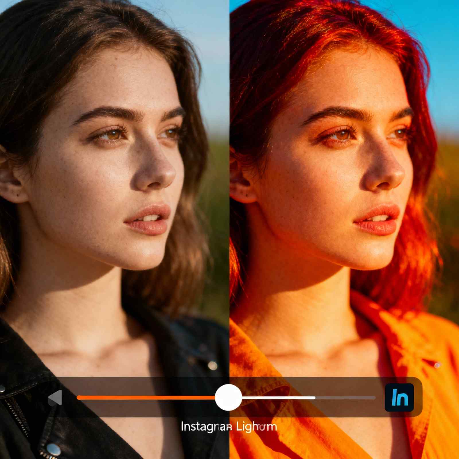
Vibrant and Saturated Presets
These presets are all about making colors pop. They increase saturation selectively (usually focusing on blues, oranges, and greens), boost contrast, and sharpen details to make images feel energetic and eye-catching. This style performs particularly well on Instagram because it stops people mid-scroll.
Vibrant presets work great for travel content, adventure photography, food photography, product photography, and any content where the colors are a key part of the appeal. Think tropical beaches, colorful street art, vibrant markets, or appetizing food presentations.
The risk with vibrant presets is oversaturation. If you push saturation too far, skin tones become unnatural (people start looking orange or magenta), skies become electric blue rather than naturally vivid, and the overall image feels harsh rather than vibrant. The best approach is to apply the preset, then selectively reduce saturation in specific color ranges if needed.
Clean and Minimal Presets
For brands and creators who want a professional, clean aesthetic without heavy stylization, minimal presets are the answer. These presets typically increase brightness slightly, add just enough contrast to make images feel sharp and clear, and make subtle adjustments to ensure accurate color representation without pushing any particular color too far.
This style is perfect for product photography, professional branding content, corporate social media, architectural photography, and any situation where clarity and professionalism are more important than artistic expression. It’s the safest option if you’re working with clients who want their products or services represented accurately.

Where to Find Quality Lightroom Presets
The preset market is absolutely flooded with options in 2025, which is both a blessing and a curse. You have endless choices, but honestly, a lot of them are low quality or just variations on the same basic adjustments. Here’s where to look for presets that are actually worth your time.
Free Preset Sources
There are legitimate sources of free, high-quality presets if you know where to look. Individual photographers often release free sample presets to showcase their paid collections. Adobe’s own community forums and resources sometimes offer free presets. And platforms like AaryaEditz org provide free preset libraries alongside their premium offerings.
The key with free presets is managing your expectations. They’re great for experimentation and learning, but they often don’t come with the same level of refinement, documentation, or support that you’d get with paid presets. Use them as starting points or learning tools rather than expecting them to be production-ready solutions.
Premium Preset Marketplaces
If you’re serious about your Instagram presence and you’re willing to invest in your visual brand, premium presets are worth considering. Marketplaces like FilterGrade, Presetpro, and VSCO offer curated collections from professional photographers and colorists.
What you’re paying for with premium presets isn’t just the adjustments themselves—it’s the expertise behind them. Professional preset creators understand color theory, they test their presets across different lighting conditions and subject matter, and they often include detailed guides on how to use and adjust the presets for different scenarios.
Individual Photographer Presets
Many established Instagram photographers sell their signature presets directly. This is actually one of my favorite ways to find presets because you can see exactly what style you’re getting by looking at the photographer’s own work. If you love someone’s Instagram aesthetic, buying their presets gives you a direct pathway to achieving a similar look.
The advantage here is authenticity and specificity. You’re not getting generic presets designed to appeal to everyone; you’re getting the exact tools that a successful creator uses in their own workflow. The disadvantage is that these presets are often more expensive than marketplace options, and they’re optimized for that specific photographer’s shooting style and conditions.
How to Use Lightroom Presets Effectively
Simply applying a preset to a photo doesn’t automatically make it Instagram-worthy. There’s definitely a technique to using presets effectively, and understanding this is what separates content that looks professional from content that looks like it has a filter slapped on it.
Start with Good Photos
This is perhaps the most important thing I can tell you: presets cannot fix fundamentally bad photos. If your image is poorly composed, badly lit, or out of focus, no preset in the world will save it. Presets enhance good photos; they don’t rescue bad ones.
Before you even think about presets, make sure your photo has good exposure (not too dark, not too bright), decent composition (interesting subject, good framing), and is sharp and in focus. If those fundamentals are in place, presets can elevate your photo. If they’re not, editing is just polishing a turd, to be blunt about it.
Adjust for Specific Lighting Conditions
One preset will not look identical on every photo, and that’s okay. In fact, that’s expected. A preset designed for outdoor photos in golden hour light will look completely different when applied to an indoor photo with artificial lighting. You need to adjust.
After applying a preset, check the exposure first. If the photo is too dark or too bright, adjust the exposure slider before doing anything else. Then check the white balance—if colors look too warm or too cool, adjust the temperature slider. These two adjustments alone will get you 80% of the way to a perfect edit in most cases.
Learn to Customize and Fine-Tune
The best preset users don’t just apply presets and walk away. They use presets as starting points and then fine-tune for the specific image. This might mean adjusting the highlights and shadows for better dynamic range, tweaking individual color saturations in the HSL panel, or adding a subtle vignette to draw attention to the subject.
Over time, you’ll develop instincts for what adjustments your photos typically need after applying your favorite presets. Maybe you always need to pull back the highlights a bit, or maybe you always need to boost the shadows. Make those adjustments part of your workflow, and you’ll develop a more consistent, refined style.
Save Your Own Custom Presets
Once you’ve fine-tuned a preset to work perfectly for your shooting style and conditions, save it as your own custom preset. This is how you develop your signature look—you start with someone else’s preset, customize it to match your preferences and conditions, and then save those settings for future use.
Your custom presets will be infinitely more useful than any preset you download because they’re optimized specifically for your camera, your lighting conditions, your subject matter, and your aesthetic preferences. This is the natural evolution of preset usage—from applying others’ presets to creating your own.
Creating Instagram Feed Consistency with Presets
The whole point of using presets on Instagram is to create that cohesive feed aesthetic that makes people want to follow you. But there’s more to consistency than just using the same preset on every photo. Let me walk through how to actually achieve a consistent Instagram aesthetic using presets strategically.
Choose One to Three Main Presets
Don’t use 20 different presets across your feed. Pick one or two (maximum three) presets that you love and that fit your brand, and stick with them. This is the foundation of visual consistency. Every photo should be edited with one of your chosen presets, with minor adjustments for specific lighting conditions.
You might have one preset for outdoor content, another for indoor content, and they should be stylistically compatible—similar color palettes, similar levels of contrast and saturation. This way, even though you’re using different presets for different situations, your feed still looks cohesive as a whole.
Pay Attention to Color Themes
Presets affect color in specific ways, and those color choices become part of your visual identity. If your preset pushes blues toward teal, that teal tone should appear consistently across your feed. If it makes oranges more red, that should be consistent too.
This is where planning your content becomes important. If you know your presets make certain colors pop, incorporate those colors into your content intentionally. If your preset makes blues vibrant, include blue elements in your compositions. If it enhances warm tones, seek out warm-toned scenes and subjects.
Maintain Consistent Brightness Levels
One of the most common mistakes I see is inconsistent brightness across a feed. Some photos are really bright and airy, others are dark and moody, and the overall effect is jarring. Your presets should maintain similar brightness levels, with perhaps some variation but nothing extreme.
If you’re using different presets for different scenarios, make sure they’re calibrated to similar brightness levels. You can adjust this after applying the preset by comparing it to your recent posts and tweaking the exposure slider to match.
Common Preset Mistakes to Avoid
I’ve made basically every preset mistake possible over the years, so let me save you some trouble by pointing out the most common ones.
Using Presets as a Magic Fix
The biggest mistake is thinking presets will automatically make your photos look professional. They won’t. They’re tools that work best when applied to good photos. If you’re struggling with the results you’re getting from presets, the problem is probably with your original photos, not the presets themselves.
Not Adjusting for Different Lighting
A preset that looks amazing on one photo might look terrible on another if the lighting conditions are completely different. Always adjust exposure, white balance, and sometimes contrast after applying a preset. This is especially true if you’re applying presets designed for outdoor use to indoor photos, or vice versa.
Over-Editing and Oversaturation
More is not always better. If you keep stacking adjustments, increasing saturation, adding more contrast, you’ll end up with images that look harsh, unnatural, and honestly, kind of amateur. Good editing is often subtle. If someone looks at your photo and immediately thinks “wow, that’s heavily edited,” you’ve probably gone too far.

Ignoring Skin Tones
Some presets do weird things to skin tones, especially if they’re not designed specifically for portraits. Always check how a preset affects skin after you apply it. If people start looking orange, magenta, or gray, you need to either adjust the preset or choose a different one for photos with people in them.
Using Presets That Don’t Match Your Brand
Just because a preset is popular doesn’t mean it’s right for you. If you’re a professional business coach, using heavily saturated, party-vibe presets might send the wrong message. Your presets should align with your brand identity and the impression you want to create.
How to Install and Organize Presets
Once you’ve found presets you want to use, you need to actually get them into Lightroom. The process is slightly different depending on whether you’re using Lightroom Mobile (DNG presets) or Lightroom Classic (XMP presets).
Installing DNG Presets on Lightroom Mobile
For DNG presets on mobile, the process is straightforward but takes a few steps. First, download the DNG files to your phone. Then open Lightroom Mobile and import those DNG files as if they were photos you shot. Once imported, tap on one of the DNG images, tap the three dots menu, and select “Create Preset.” Give it a name and save it to a preset group. Now you can apply that preset to any of your photos.
The DNG files themselves can be deleted after you’ve created the presets from them—they’re just the delivery vehicle for the preset settings, not something you need to keep permanently.
Installing XMP Presets on Lightroom Classic
For desktop presets, it’s even easier. In Lightroom Classic, go to File > Import Profiles & Presets. Navigate to where you downloaded the XMP files, select them, and click Import. They’ll immediately appear in your presets panel, organized however the creator structured them.
Organizing Your Preset Collection
As you accumulate presets, organization becomes important. Create folders or groups for different preset styles—maybe one for bright and airy, one for moody, one for film emulation. This way, when you’re editing, you can quickly find the type of preset you’re looking for without scrolling through dozens of options.
I also recommend having a “favorites” folder where you keep the 3-5 presets you use most often. This speeds up your workflow significantly because you’re not hunting through your entire collection every time you edit.
The Future of Presets and Instagram Editing
It’s worth thinking about where presets and Instagram editing are headed as we move through 2025 and beyond. AI is increasingly being integrated into photo editing tools, and honestly, it’s changing the game in some interesting ways.
Adobe is building AI features into Lightroom that can automatically adjust photos based on subject matter, lighting conditions, and even your personal editing style. These AI adjustments are essentially dynamic presets that adapt to each individual photo. At some point, the line between traditional presets and AI-assisted editing might blur completely.
But I don’t think traditional presets are going away. There’s value in having a signature look that’s consistent and intentional, rather than leaving everything to AI interpretation. The photographers and creators with the most distinctive visual styles will probably continue using presets as a foundation, perhaps combined with AI tools for specific adjustments.
Final Thoughts on Lightroom Presets for Instagram
After years of using presets and watching Instagram’s visual culture evolve, I think the key takeaway is this: presets are tools, not solutions. They work best when combined with good photography fundamentals, an understanding of your brand and audience, and the willingness to customize and adjust rather than just applying and posting.
The best Instagram feeds aren’t built on presets alone—they’re built on consistency, quality content, strategic planning, and yes, smart editing workflows that include presets as one component. If you’re looking to develop a comprehensive approach to your Instagram content, exploring various editing resources and platform tools can help you find the right combination of tools and techniques that work for your specific style and workflow.
Start with free presets to experiment and find what resonates with your style. Invest in premium presets once you know what aesthetic you’re pursuing. Customize everything to match your specific shooting conditions and preferences. And most importantly, remember that the goal isn’t to make every photo look identical—it’s to create a cohesive visual language that’s recognizably yours while still allowing individual photos to shine.